
While we often put in a lot of effort into perfecting various aspects of our marketing copy, we sometimes don’t give the CTA as much attention as it deserves.
Yet, research shows that the CTA is just as important as other parts of our marketing copy; in fact, more than 90 percent of people who read a headline will also read your CTA copy.
Furthermore, research by ConversionXL Institute found that about 97 percent of people pay attention to the headline of a piece of content, only 60 percent will scroll down to the bottom of an article – and then the majority of those are more likely to skim through rather than read your content.
In other words, a lot more people are looking at the CTA in a piece of content than the actual copy. In light of this, you’d expect businesses to pay more attention to their CTA. Unfortunately, research shows that this isn’t the case: more than 70 percent of small business websites don’t contain any call to action.
The implication is even more serious for social media.
Research by AdRoll found that social media CTAs are so powerful that adding a CTA button to Facebook ads resulted in a massive 285 percent boost in conversions.
So how do you create CTAs that convert?
By understanding the psychology behind it. In this blog post, I’m presenting seven experiments to consider to increase your CTAs’ performance.
Starting with the power of curiosity.
1. Use curiosity and incentives to make your social media CTAs more effective
When designing CTAs for social media, it is very important to ensure that it taps into your audience’s curiosity.
While many factors can influence people’s response to your social media CTAs, AdRoll found that the best performing CTAs use curiosity.
The study found that CTAs that used the word “Learn More” significantly outperformed CTAs that used the words “Download,” “Shop Now,” “Sign Up,” or “Book Now” when it comes to CTR (Click-Through-Rate).
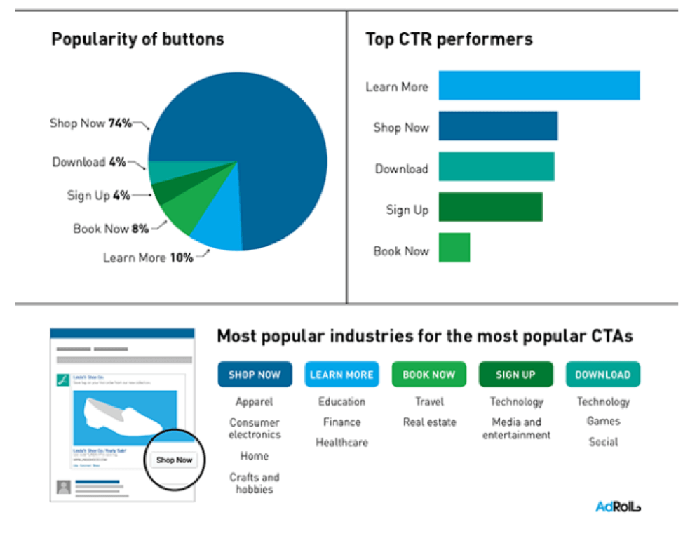
CTAs that offer an incentive (usually a free download) were also found to be equally effective.
AdRoll’s study found that the third most popular CTAs on Facebook are those that offer a free download.
This finding was corroborated by a study from Twitter.
Twitter’s study analyzed 20,000 Promoted Tweets that were randomly sampled over three months to see which social media CTAs are most effective.
The study looked at how engagement with tweets varies based on the call to action used in comparison to tweets with no call to action. The findings were revealing!
Twitter’s study found that calls to action that offered a download performed a lot better than those that didn’t. Tweets that asked people to download (accompanied by a link) resulted in 13 percent more people clicking on average.
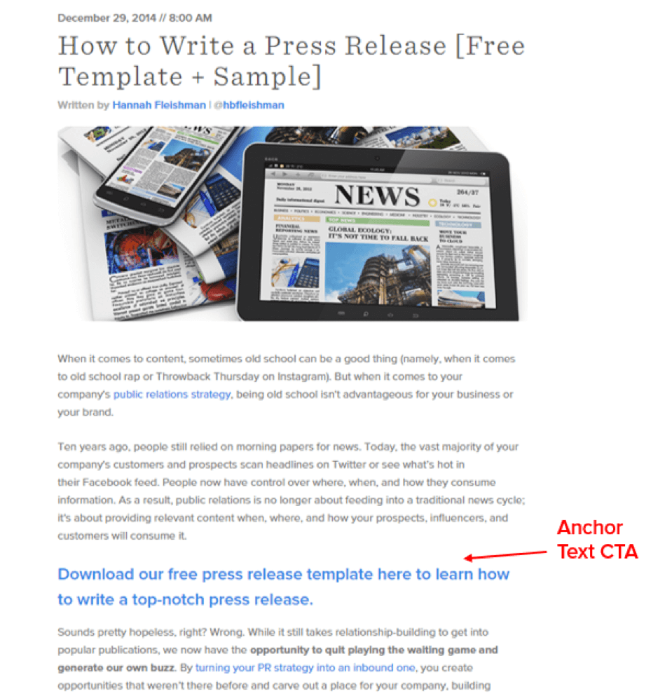
2. Use an Anchor Text CTA
While there are many ways to use a CTA, research shows that you are going to get better results when you use an anchor text CTA. Based on an analysis of the performance of posts on its blog, Hubspot found that using what they call an “anchor text CTA” resulted in significantly more leads than using a generic CTA.
Specifically, Hubspot found that:
- Using anchor text CTAs increased conversion rates by up to 121 percent.
- Up to 93 percent of leads generated from the content on their blog came as a result of anchor text CTAs.
These are some very compelling statistics. This begs the question, then, “What is an anchor text CTA?”
An anchor text CTA is a standalone text-based CTA in a piece of content that links to a landing page. It is styled in H3 or H4 to help it stand out when compared to other parts of the content’s copy.
3. Experiment with color
You’ve probably come across the “what’s the best CTA button color?” debate before.
And more than likely, you came across very different answers that left you more confused than you were, to begin with.
In some cases, the best CTA button color is said to be red. Sometimes, it is said to be orange. At other times, it is said to be green. Except it isn’t any of these colors.
I’d like to break it to you, though: there is no “best” or “right” CTA button color.
Instead, the most important thing about your CTA is that it should never blend in with your site’s design/color scheme; instead, it should use a color that contrasts with the main color of your site.
For example, take a look at the CTA color used when Hubspot did its study on CTA button color:
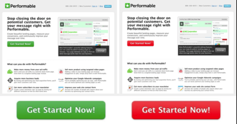
A careful look shows that the red CTA button stands out better as it contrasts more when compared to the green CTA. The result was a 21 percent increase in clicks.
4. Follow the Less is More Principle
After analyzing 969 landing page CTAs, Copy and Check found that the average number of CTAs on each page was 2.68 percent. In fact, one of the pages analyzed had a whopping 15 CTAs. Not good!
When it comes to CTAs, you want to follow the less is more principle.
This makes sense when you consider the fact that psychology research has long established that giving people more options will result in them being less likely to actually act on any of those options. Of particular note is the 2000 Jam Study by psychologists Sheena Iyengar and Mark Lepper.
In the study, shoppers at an upscale food market were divided into two groups; the first group was shown a table with 24 varieties of gourmet jam while the second group was shown a similar table with just six varieties. While the table with more jams attracted more viewers, the table with fewer jams converted 10 times better.
If possible, you should have just one CTA on your landing pages. While this might appear difficult if you have a lot of offers, the solution isn’t to have more CTAs on the same page. It is to create more landing pages each with their own unique CTAs; research shows that this can result in 12 times more leads.
5. Experiment with the first person
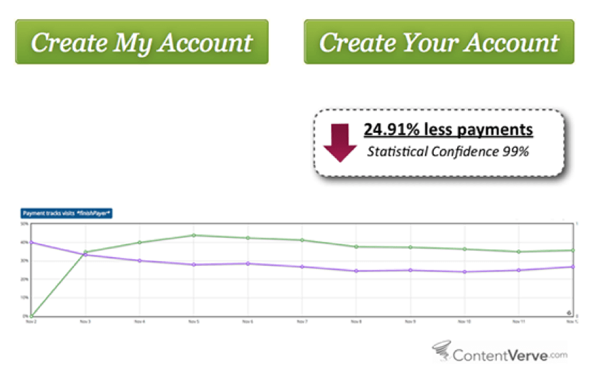
Perhaps one of the easiest and quickest wins you can get when it comes to creating CTAs is writing your CTAs in the first person.
In a series of experiments, ContentVerve found that simply changing the word “your” to “my” in a copy resulted in better conversions.
For one of the experiments in which the CTA “Create My Account” vs “Create Your Account” was used, they found that the CTA version that used “My” converted 24.91 percent better than the CTA that used “Your.”
In another experiment involving a PPC landing page for Unbounce, they found that simply changing the CTA text from “Start your free 30-day trial” to “Start my free 30-day trial” resulted in a 90 percent increase in click-through rates. This is a huge increase, just for changing a word!

I’d like to stress that this is not rocket science. These are experiments run in a specific context, for a specific audience. It’s not because an A/B test was conclusive for Company Y that it will also be conclusive for Company Z.
Now, the one-size-fits-all model doesn’t work anymore. Another way to significantly increase your CTAs’ performance is to personalize them based on who is standing in front of them.
6. Personalize Your Email CTAs
In a world increasingly leaning towards automation and artificial intelligence, personalizing your email CTAs will result in huge marketing gains for you — and there’s no reason not to personalize your email CTAs when you consider the fact that even basic email marketing services allow personalization.
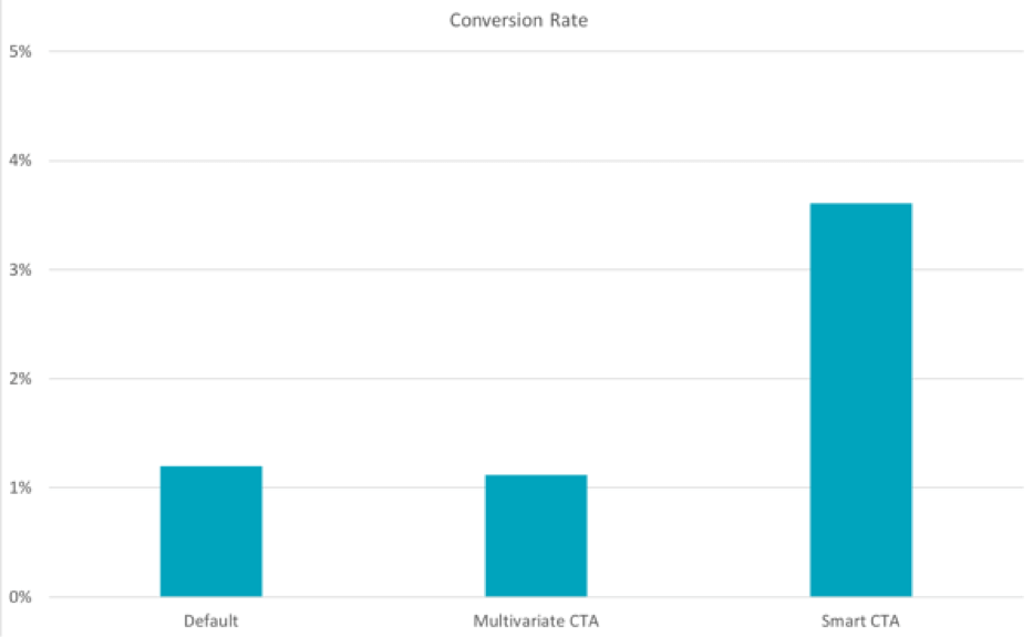
Hubspot’s study that analyzed over 330,000 CTAs over six months reveals how powerful personalized CTAs can be. In the study, CTAs were grouped into three categories:
- Basic CTAs or CTAs that are fixed and do not change regardless of individual differences among visitors to a website.
- Multivariate CTAs or CTAs in which two or more CTAs are split tested against a portion of traffic to a website and a winner is decided.
- Smart CTAs or personalized CTAs that are customized and targeted to different user segments based on different variables; these variables could include user location, gender, language, history with you, purchase history, or several other variables.
Hubspot found that personalized CTAs converted significantly better than both basic and multivariate CTAs. Specifically, Hubspot’s study found that personalized CTAs converted 202 percent better.
7. Work on The Size of Your CTA
The size of your CTAs can also affect how your audience responds to them. More often than not, bigger CTAs will yield better results.
According to Fitts’ law, the amount of time required to move a pointer to a target area will be influenced by both the distance and size of the target.
As such, it will take longer to reach smaller targets compared to bigger targets (particularly over longer distances).
The implication of Fitts’ law when designing your CTAs is simple: making your CTAs bigger will reduce the time it takes to access them and as a result ensure more people click them, resulting in a conversion increase for you.
This fact was demonstrated by a WiderFunnel case study in which increasing the size of the CTA button on a landing page contributed to a 32.5 percent increase in conversions.
Note: Again, this needs to be tested as it’s not necessarily going to work for all websites, brands, and audiences.
Experimentation is key
The advice you find in this blog post is likely to affect your conversion rates positively. That being said, testing is not rocket science and I strongly recommend that you use an A/B testing solution to validate – or invalidate – your hypothesis.
So, test away!