As you probably know, a great website is made by more than just beautiful design. Yes, aesthetics genuinely play a role in encouraging web visitors to convert (or perceive your brand as trustworthy and authoritative). But unless your site is also capable of predicting and meeting user needs, its chances of serving your brand are considerably diminished.
This is where customer-centricity in web design comes into play. By designing an online space built around the wants, needs, and behaviors of your target customers, you can create a website that yields high conversion rates, gets your buyers to make repeat purchases, and, ultimately, nurtures customer loyalty.
And the best thing about customer-centric web design is that it’s easily achievable by making design decisions that prioritize the customer experience. So, if you’re ready to make small changes that hold lots of potential, these are the simple ways to prioritize your website users and their browsing experience.
Table of Contents:
- Understand Your Audience
- Invest in Speed
- Simplify Your Conversion Mechanics
- Cater to Your Mobile Users
- Create Dedicated Landing Pages for Known Customer Pain Points
- Sell Customer Value, Not Features
- Supplement Long-Form Content With Video
- Show Visitors That You’re Available in Person
- Embracing Customer-Centricity: Final Thoughts
Understand Your Audience
As you start exploring strategies that will allow you to create a customer-centric website, you first need to define who your customers are.
If you haven’t done this already, take the time to really research and understand your audience. Build customer and buyer personas and create a comprehensive set of guidelines regarding the identities, needs, and wants of your target consumers.
Once you have this data, you can start making design decisions that align with the preferences of your target audience, instead of following hunches or copying your competitors’ (potentially wrong) approach to web design.
For instance, something as simple as adapting your hero image and value proposition to align with your audience’s wants can allow you to build an online experience tailored to your potential customers.
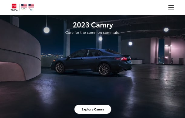
A quick look at the Ferrari and Toyota websites shows how the two brands employ customer-centricity to appeal to their target audiences.
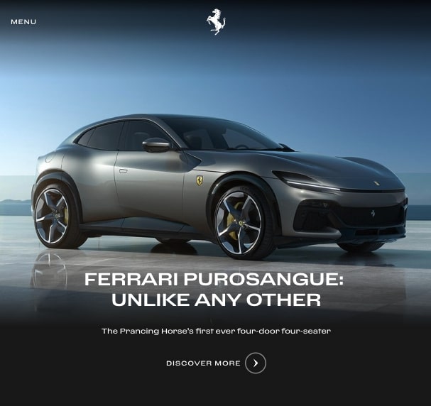
While Ferrari highlights the power, exclusivity, and uniqueness of its vehicles, Toyota uses a sales proposition that’s a bit more approachable. It addresses a pain point most people relate to — the frustrating nature of going through a daily commute.
By doing this, both brands ensure that they’re creating browsing experiences that appeal to their most likely buyers. That’s how they’re preventing the ramifications of presenting web visitors with irrelevant or alienating value propositions.
Invest in Speed
Website speed hugely determines your web visitors’ browsing experience.
Research from Portent revealed that page load speed directly correlates to conversion rates, with sites that load in 1 second enjoying 3x higher conversion rates than those that load in 5 seconds or more.
Moreover, a consumer survey by Unbounce found that 45.5% of people were less likely to purchase from an ecommerce site if it loads slower than expected.
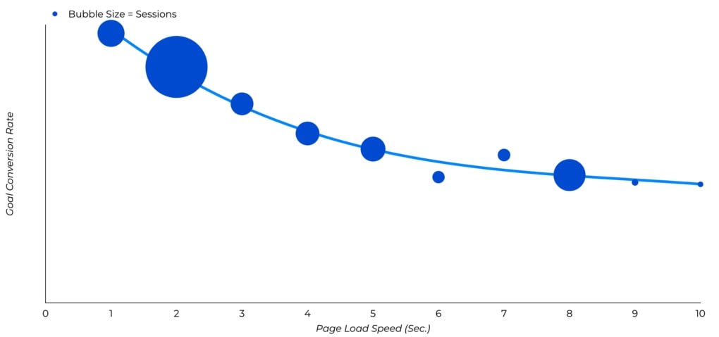
With this data in mind, it’s easy to conclude that site speed is one of the key elements of a customer-centric website. So, if you want to create a better browsing experience for your potential clients, invest in speed.
First and foremost, test your site with a reliable tool such as GTmetrix.
Then do your best to:
- Minify CSS and JavaScript files
- Enable deferred or asynchronous execution
- Use browser HTTP caching
- Avoid redirects
Finally, don’t forget to optimize your image and video files by using next-gen formats. You can even consider removing any visuals that aren’t actively contributing to an enjoyable user experience.
Simplify Your Conversion Mechanics
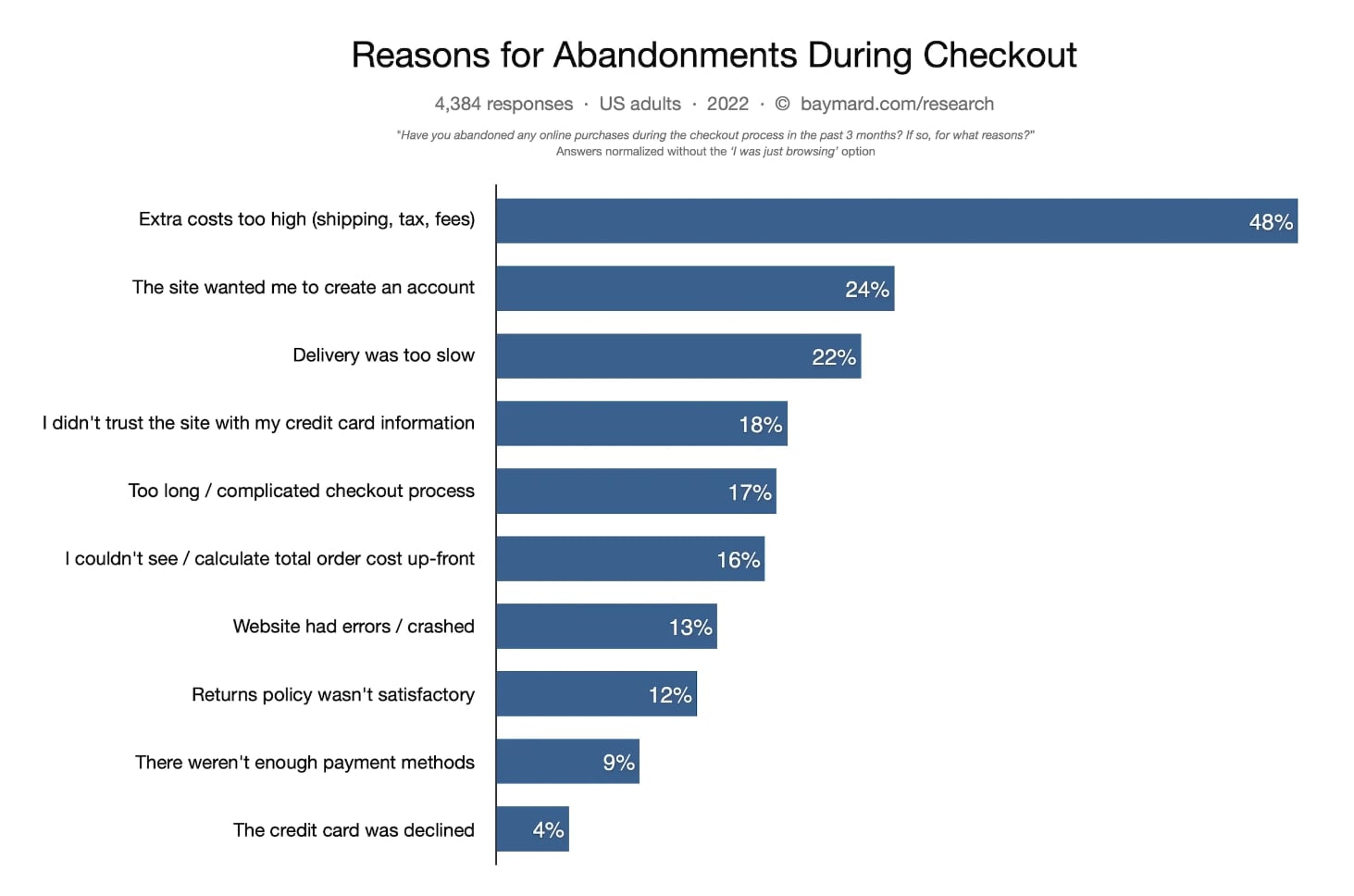
Did you know that 17% of online buyers abandon their shopping carts because they don’t have the patience to deal with a long/complicated checkout process?
That’s right: forgetting about CX when designing your site’s conversion mechanics can cost you a lot of business.
Luckily, the solution is quite simple. To design a customer-centric site that converts, all you need to do is simplify the checkout process.
If you’re not convinced this is the way to go, simply do your own math regarding what benefits your business more profoundly.
Are you more likely to profit by risking higher cart abandonment rates, but getting access to customer information you can use for marketing purposes down the line? Or should your focus be on converting website visitors into buyers, then turning them into repeat customers by delivering a next-level CX?
For most businesses, the higher conversion rate will represent a more attractive prospect. And the great news is that simplifying your conversion mechanics doesn’t have to be too complicated.
Integrate Third-Party Apps
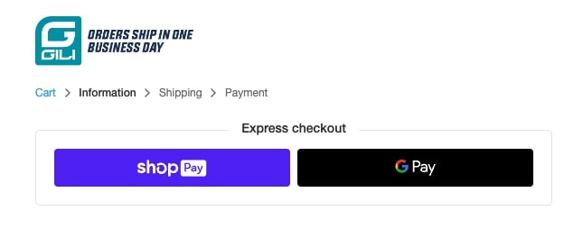
One excellent solution is integrating third-party apps to make it easier for web visitors to turn into customers.
GILI Sports, for instance, does this by employing payment processors that significantly speed up the purchasing process. Seeing that both GooglePay and ShopPay allow shoppers to save their contact details (and even give them the option to pay in installments), they significantly cut down on the time between a web visitor clicking the “Check Out” button and completing the purchase. In fact, in some cases, the process is done with just a quick verification. This minimizes friction and the likelihood of potential clients backing away from the purchase.
Simplify Your Forms
Using third-party apps isn’t the only way you can prioritize your website users when designing your website. You can achieve equally powerful results by taking the time to review the required fields in your online forms and seeing whether there is any info you could go without.
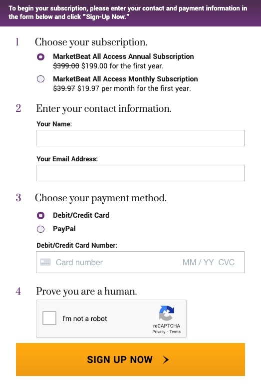
For example, take a look at the MarketBeat sign-up page. You’ll notice that there are only two pieces of personal information new subscribers need to fill out — their name and email address. Considering how people loathe having to fill out long forms, that is a truly customer-centric way to secure conversions.
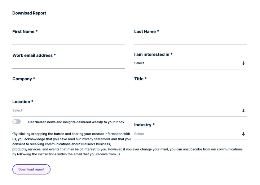
Now compare MarketBeat’s sign-up process with the one on the Nielsen website. The second organization, even though highly reputable and capable of providing unique insights across a variety of industries, requires prospects to fill out no less than eight fields. The approach could be seen as too much by some of Nielsen’s prospects, and might even lead to higher-than-optimal bounce rates.
Cater to Your Mobile Users
As of July 2022, mobile accounts for 58.99% of all web traffic worldwide. So, to create a customer-centric website, you must ensure an enjoyable browsing experience even for people consuming your content on small screens.
To successfully cater to your mobile users, aim to:
- Make your website responsive.
- Use sufficient negative space to allow high-value conversion elements to stand out.
- Prioritize accessibility with fonts and text size.
- Increase loading speeds.
- Remove intrusive elements (popups and content blockers), which could make it difficult for visitors to complete actions on your site.
Kvell Home is a brand that follows all of these design tips to create a web browsing experience that’s entirely user-oriented.
A quick look at the company’s site shows that it follows all the above tips for designing a mobile-friendly website. Furthermore, comparing the desktop and mobile versions of the site reveals that the mobile version is more customer-centric. This signifies that Kvell Home knows what types of devices its customers use when browsing for products.
Create Dedicated Landing Pages for Known Customer Pain Points
Sometimes, the best way to be user-centric when designing a website is to go super-niche.
By addressing highly specific customer pain points with specially-made landing pages, you’re not just helping your audience discover the solutions they need. You’re showing that your brand understands its audience and offers a product/service that could genuinely help them. And with that, you’re making your potential clients feel seen and understood.
Moreover, it’s worth noting that landing pages that address niche customer pain points benefit you from an SEO standpoint. After all, targeting long-tail and low-volume niche search terms maximizes the chances of your content being shown to the people who will gain the most value from it.
What constitutes a pain point is going to differ from one brand and its product to another. To implement this strategy effectively, companies will need to have an extremely granular view of the reasons why leads would be interested in becoming customers.
Wherever these reasons solve a problem in their lives or businesses, it can be identified as a pain point, and the more niche this pain point is, the better.
Take a look at what Sendinblue did on this particular landing page where they target a very specific group of potential customers: those who are uncomfortable with Mailchimp’s updated payment plans.
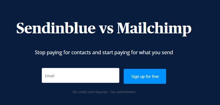
All the content on this page targets concerns and issues related to the primary pain point – the most obvious of these messages appearing in the page header: “Stop paying for contacts and start paying for what you send”. With this one statement, the brand addresses the primary reason these leads would navigate to this landing page.
Sell Customer Value, Not Features
When attempting to prioritize your website visitor’s needs during the design process, one simple hack you can employ is to focus on customer benefits instead of product features.
Yes, features are essential when selling products and services. But the drawback is that features only speak about your product and company. And seeing that your website visitors’ experiences aren’t a part of that conversation, the effect could potentially mean alienating your prospects by not being clear about what they get.
Value selling, on the other hand, allows you to zoom in on the pain points your audience wants to solve. It often relies on delivering personalized messages and experiences (which 71% of consumers expect to get from brands). According to research, personalization boosts revenue by as much as 25%.
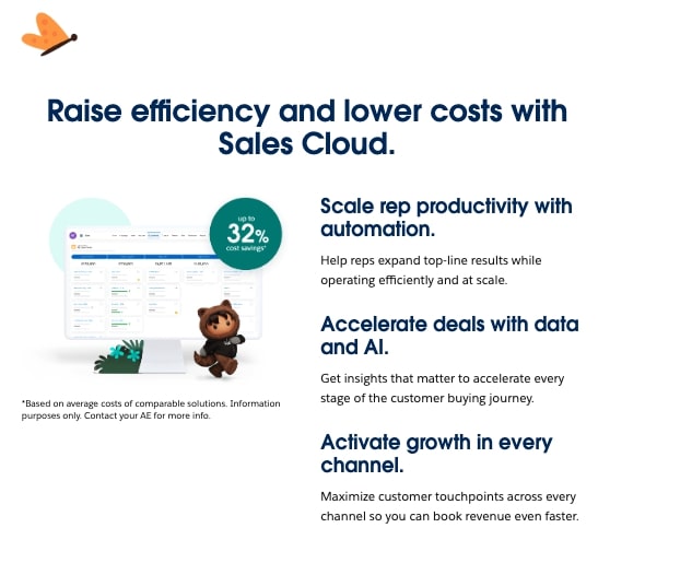
For an excellent example of a brand that nails value-based selling, check out Salesforce.
Instead of going on about the technical capabilities of its products or its company history, this brand aims to engage web visitors with a fully user-centric approach.
The value propositions are benefit-oriented, explaining the exact results new customers can expect from the software and even providing statistical data regarding the average cost savings Salesforce’s solution achieves.
Supplement Long-Form Content With Video
You’re probably aware that people don’t read word-by-word when browsing online content.
Instead, they scan web pages to locate the information they’re after. And while you can employ visual web design hacks to make your website is more user-centric, the better way to deliver an enjoyable browsing experience is to explore ways to make your content more accessible to a wide audience.
Focusing on readability is one such way to make your content more approachable. Moreover, supplementing your text-based content with visuals like infographics, images, screenshots, and illustrations can help you communicate complex subjects and drive comprehension.
However, if you want to utilize the ultimate hack for customer-centric design, simply supplement your long-form content with video.
Vidyard’s 2022 Video Benchmarks Report, for instance, shows that video engagement rates are higher than ever, with 54% of viewers watching videos till the end (and even more if the total run-time is shorter than 60 seconds).
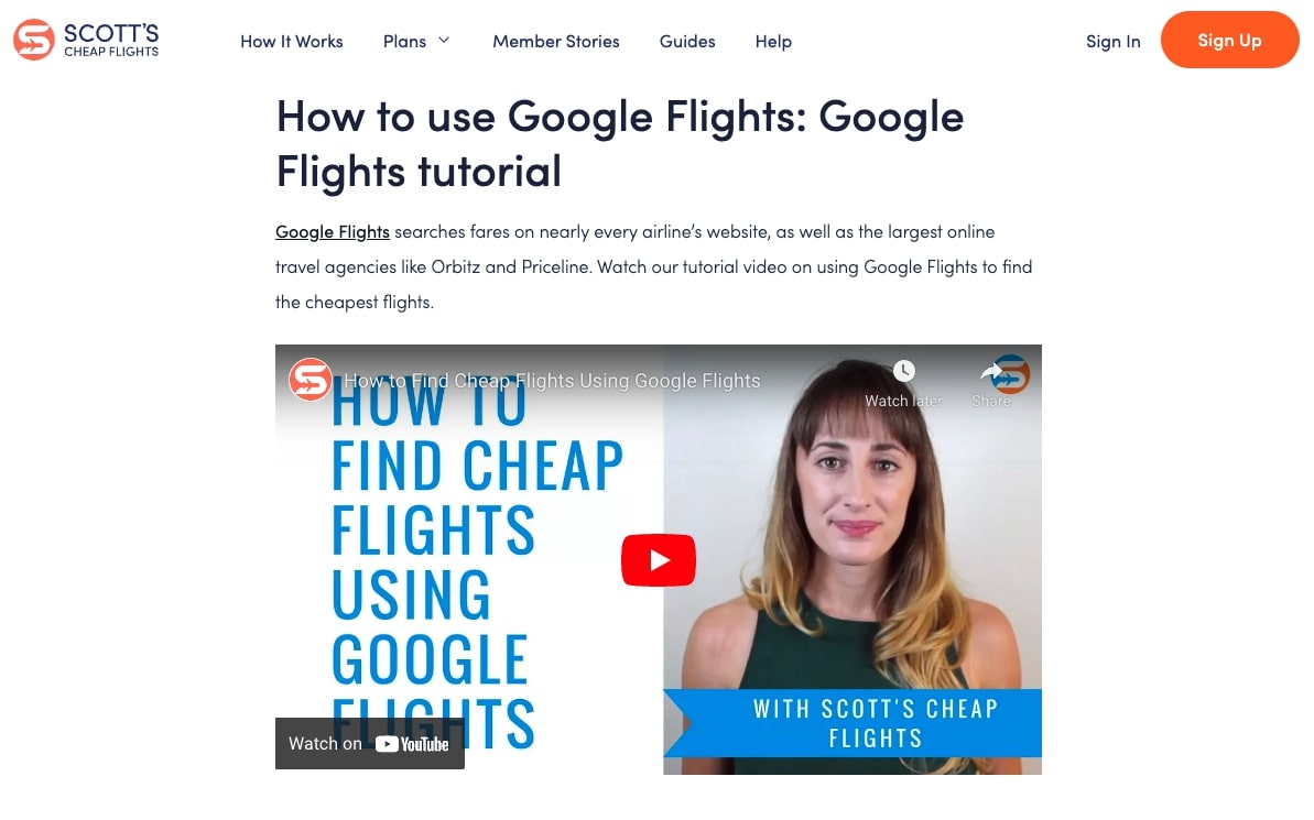
So, if you’re looking to make your website more appealing, why not turn your articles into easily-viewable videos that you embed on your content pages, as done by Scott’s Cheap Flights below?
This is more than just an effective way to create content consumption experiences that are user-centric. More importantly, it’s an approach that yields a high ROI, seeing that the initial investment doesn’t require a large budget while still delivering exceptional results.
Show Visitors That You’re Available in Person
Finally, as you endeavor to create a website experience that prioritizes your customers, don’t forget that online communication isn’t everyone’s cup of tea.
Sure, many people are open to communicating with chatbots and using self-service resources to solve their pain points.
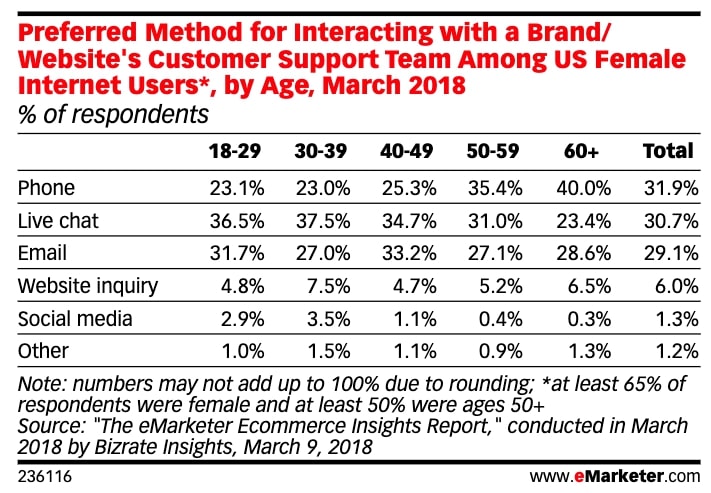
However, more conservative target audiences still prefer to interact with customer service representatives via the phone, with as many as 40% of elderly consumers choosing this communication method over other options.
So, if you’re looking for a customer-centric design strategy, you might want to show your visitors you’re available in person.
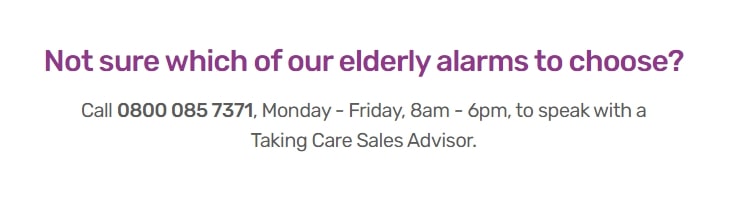
Let’s take a look at a brand that’s shone just the right amount of light on their availability. Taking.care mentions their human support on no fewer than three locations on their home page. Each time they do so, the message is clear: we are available 24 hours a day, 7 days a week.
The repetition of this message goes a long way to ensuring visitors that this is a brand with customer-centricity at its heart,
Embracing Customer-Centricity: Final Thoughts
When it comes to website UX, there’s one thing you need to accept early on: there will always be room for improvement. Nonetheless, if you’re prepared to embrace customer-centricity and implement it into your site’s design, you’re guaranteed to see benefits.
So, whether you try out one or all of the design tips covered in this guide is up to you. Either way, make sure you take a close look at the examples and gather inspiration. Consider how the tactics could benefit your target audience, and see how you can use them on your site.
Most will be simple fixes. But rest assured, even those that require a bit more work will go a long way in proving to your prospects that your company has what it takes to efficiently solve their pain points.