One of the thing that drives me crazy when I look for social media design tips is that most of the time they seem way too complicated.
The writers want you to completely rethink your social media images or jump on the hottest new trends.
And I know that those changes are not possible for every marketing team. Especially if you don’t have a designer to help you out.
Even some of my design tips may be a little outside of the bandwidth of a lot of smaller brands.
That is why I wanted to come up with some hacks that literally anyone can implement in a few minutes.
All you really need to take advantage of these tips is a design program and the desire to create something amazing.
And that’s it! So let’s get started.
1. Center all of your icons, illustrations or graphics
Not centering your content, icons or graphics is one avoidable thing that I see hurt a lot of marketers.
This may seem like an extremely simple tip but so many brands forget it! Especially if they are in a rush or not a designer at heart.
And now with the fragmentation of users across mobile and other devices it is best to use a central focal point. This will ensure your image or graphic looks great no matter the screen.
For example take a look at these visuals from Asana:

Each graphic has a different type of content, but it’s always right in the center of the frame.
Additionally, Twitter has already started automatically cropping photos, so it’s best to put your eye catchers right in the middle.
Both vertically and horizontally, this way they will not be cut off by machine learning.
While you are at it I would recommend using a bit of padding on all sides of the icon, text or graphic. Like so, in these examples from Highbrow:

I even cropped a solid chunk of image off these image examples and they still look great. Taking a similar approach will help each of your images be seen in full by every user.
And with a central focal point a reader’s eye will know exactly where to look.
At Venngage we actually take this tip literally with all of our social media graphics as well:

So I guess you could say we eat our own dog food.
2. Always use more than one font or color for text
If the previous tip was a little too hard for you then maybe you should skip this one too.
Just kidding!
All you need to know how to do is change the a font color or two in your graphics. Literally that is it!
When we’re creating infographics we use different font colors to draw attention to important info or stats.
It works especially well because your eye is drawn to the one thing that is different than the others. Just like your eye was drawn to the bold font I used few lines up.
But this design hack is not limited to just infographics, you can use it to upgrade your social media graphics.
One of the best examples of this on social media comes from the designers at Content Marketing Institute:
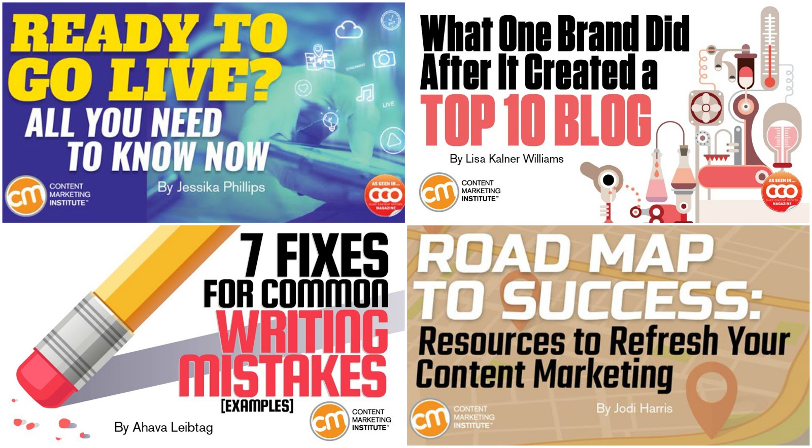
I am guessing your eye was drawn directly to the phrases that used a unique color.
You saw “Writing Mistakes” and “Top 10 Blog” first. And that is the point.
They want those keywords or interesting phrases to jump of their feed and grab your attention. All the other words are just filler, but those keywords will make you want to learn more.
They know exactly what they are doing with the different colors. Because they use this hack on almost every single graphic they share.
Another fantastic of this tactic in action comes from the marketing industry as well, Social Media Examiner:
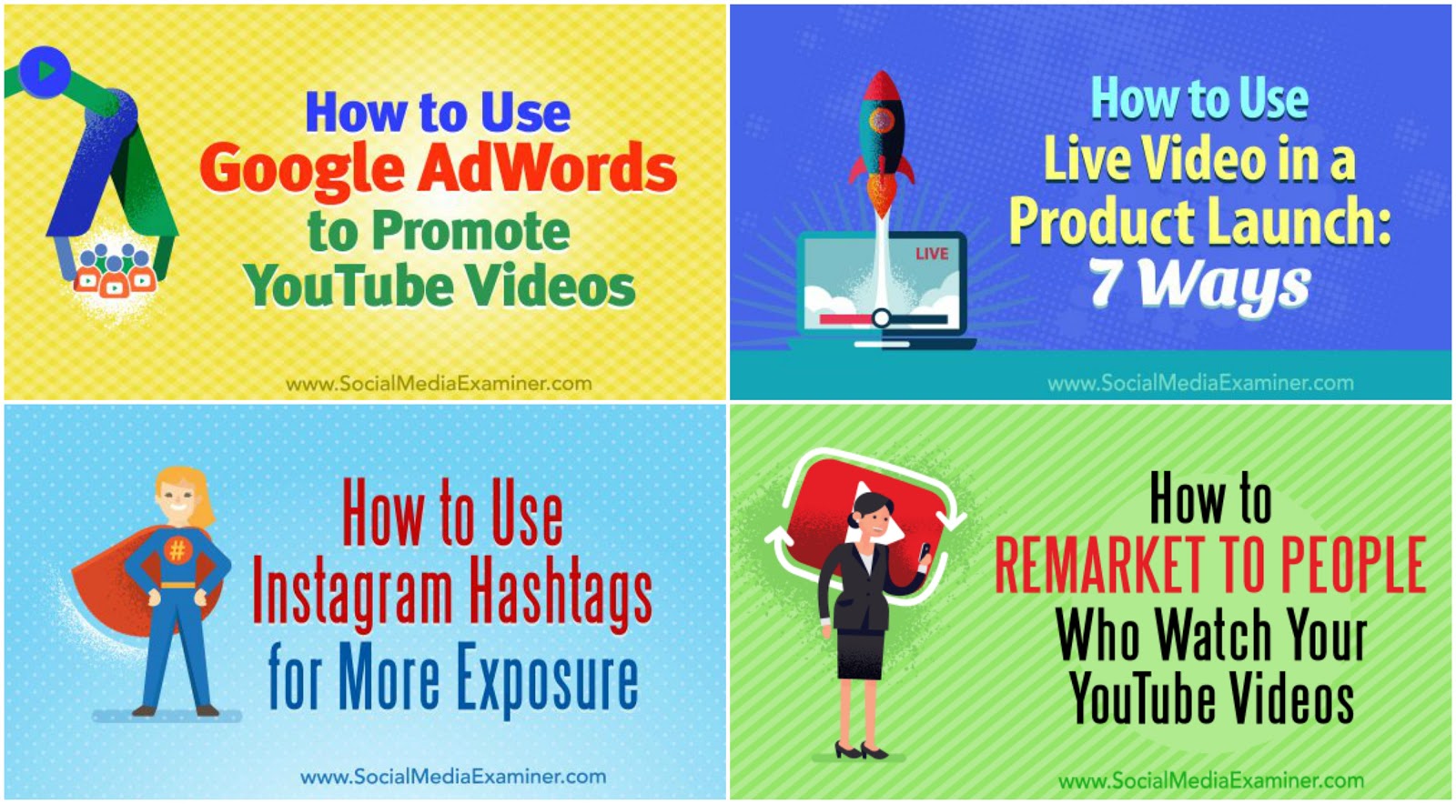
They take it a bit further with their graphics and use three font colors throughout. However, each social graphic still uses a bold color to highlight a keyword or phrase.
And each of the other colors pull the reader down further into the text, which is always a plus.
3. Integrate brand colors in every graphic
You have already spent a ton of time finding colors that fit your brand perfectly.
Maybe it’s a dark blue that projects trustworthiness. Or a vivid red that shows off your competitive spirit.
Whatever the colors may be, they are obviously a big part of your visual identity.
So why would you avoid using them in your social media graphics?
It really doesn’t make a whole lot of sense to me. But I have seen a lot of smart brands make this mistake many times.
However, one brand that seems to always include their trademark color is Hubspot:

They have almost monopolized the color orange, and use it every chance they get. Even if it’s just an accent color, which is a great hack that you can utilize in your graphics as well.
That orange is so well known in the marketing and business world that people know where the shares came from instantly as well.
And when you are fighting millions of other shares for attention, that quick recognition is extremely valuable.
The designers over at Discord know how valuable their colors are as well:

Each image they share has a hint of their purple sprinkled throughout. But what I really like about these examples is they show a few diverse ways to use brand colors.
For example in one it is just the background but another one the purple is the main color.
Each has just enough of their recognizable colors to help followers see it in a noisy social feed.
However, if you want a more subtle way of using your brand colors, I would recommend following The Next Web’s lead:
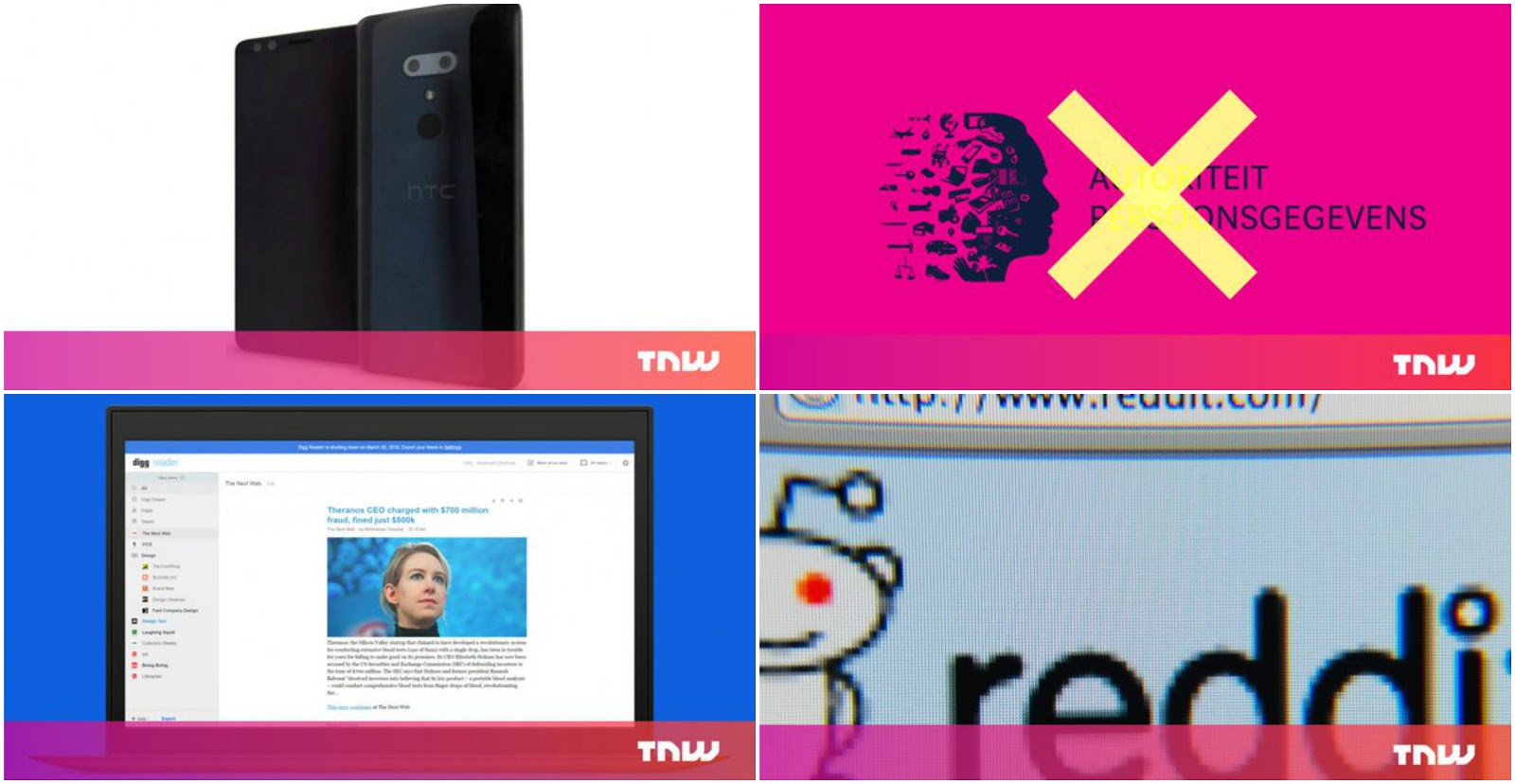
This is a simple way to inject your branding into each share, and can be used with almost any graphic or image.
Plus even if your content gets shared on other accounts, the readers will know it came from your company!
4. Never use a raw stock image
I hate stock photos so I am not going to recommend you use them on social media.
They are literally one of the easiest ways to spot a lazy social media manager or content creator.
Could you not take five minutes to create a custom graphic for the content you just spent hours on?
Come on.
All of the tips I have given you in this article will hopefully cause you to never use stock photos again.
But if you have to use a boring stock image or a photo at least add a something to it!
It takes exactly one minute and will upgrade your graphic immensely.
I mean a simple gradient can instantly make your stock photos look incredibly interesting.
If you haven’t heard yet, gradients are making a comeback in 2018.
Bleacher Report, my favorite sports site, is large brand that’s embracing gradients in a packed industry.
In an industry dominated by video clips and generic action shots, they use gradients to highlight some of their longer form written content.

They use these subtle gradients to stand out in a very busy sports world quite well. And they can own gradients as part of their social media brand too.
And all of this was done with a simple gradient, a design trick the internet loves to hate. But as we’ve seen in these examples, they are a great way to add a little bit of eye-catching color to your design.
But if gradients aren’t your thing, you can still upgrade your raw stock photo with some interesting text. Like Wishpond does with each of their shares:
Not only does this look a lot better than a stock photo, it gives your eye a spot to look.
Honestly, stock photos are built to be vague and subtle, those are not things you want your social media graphic to be at all.
But adding some simple text or a title will help bring eyes directly to your shares in no time!
And as you can see, they took our advice and added a bold color to their important keywords.
It’s great when you find an example that illustrates two hacks so well!
—
And there you have it, 4 simple hacks that you can start using right now!
Who would have thought I would be applauding the use of gradients in 2018?
No one? Yeah me either.
But I am guessing that weirder things are going to happen this year.
So keep your eye peeled for great examples you can emulate.
Or check out this full guide on creating better social media images.
Oh, and stop using boring stock images, your content deserves better!


